
Below are a few reasons why I can't love iOS 7. It's a good operating system and I want to love the OS, as discussed in 'Why I Prefer Mavericks as an upgrade to iOS 7'. However, there is this looming feeling during use that Apple went too far or didn't go far enough. After several months of using iOS 7 I finally understand what irks me the most about the OS: iOS 7 is a bit of a digital oxymoron. It manages to be polished yet unpolished, a little too gaudy yet a little too simplistic, very systematic in instances and not not at all systematic in other instances.
What do I mean? Below is a brief visual guide of a few of my gripes.
Lock Screen Faux Pas
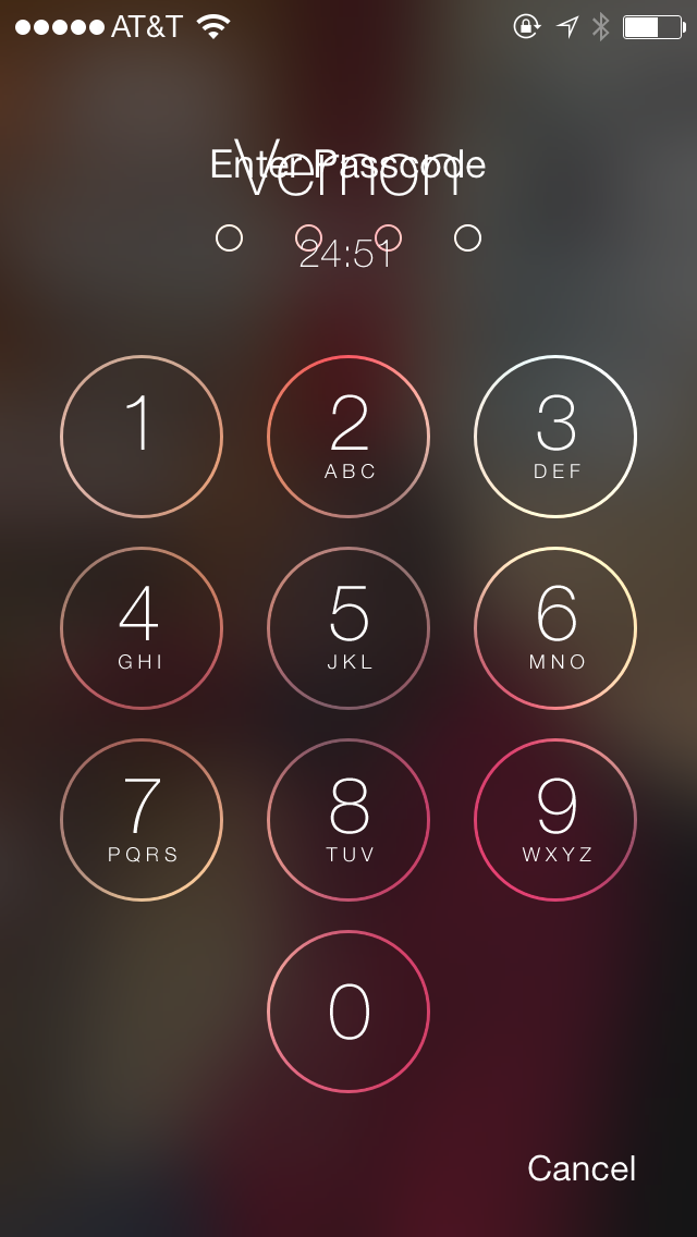
Have you ever seen this? The text overlap that appears on the lock screen is a good example of where iOS 7 lacks some polish. If you actually use your iPhone for phone calls, occasionally upon passcode's initiation you'll notice the embarrassment above when you go to unlock your phone. I imagine this one is much more of a problem for persons who do not use an iPhone 5s, or who may have a 5s with passcode enabled and do not use touch ID. This may explain why its gone uncorrected in the past few .0x updates: Simply not enough of the right people have seen this.
Safari Button Location
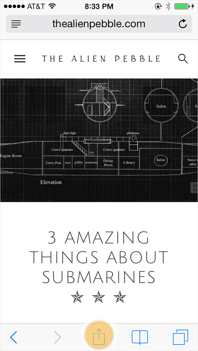
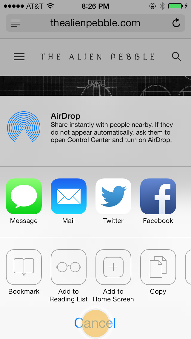


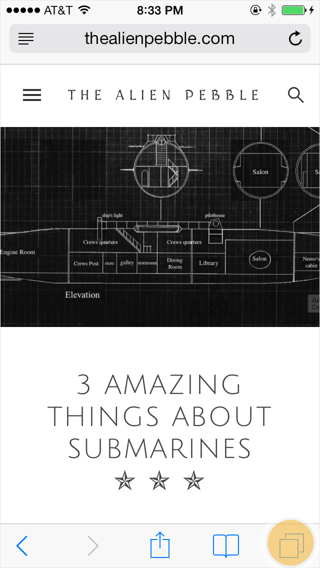
I wont rehash arguments made by so many others regarding the oversimplification of iOS 7's textual button design. Instead, let us only consider the location of the "cancel/done" button in Safari. It is not at all systematic. Press 'share', and the "cancel" button is located in the bottom center in larger text than elsewhere. Press 'bookmarks / reading list' and the "done" button is located at the top right in bold. Press 'new tab' (which is almost identical to the icon for "copy") and "done" moves to the bottom right and is a different sized font from "done" in 'bookmarks'. These annoyances will only be amplified in the forthcoming larger screen iPhone. It will be more surface area for your thumb to travel, and thus much more noticeable.
Inefficient use of Homescreen in Multitasking

Why display the Home Screen during Multitasking mode? Since Apple does display the Home screen, it seems intuitive that pushing or swiping the Home screen up or down while in multitasking mode should yield some action. For example, swiping up could reload Springboard and close all running apps saving the user the hassle of closing apps individually (or relatively individually if you multi-swipe away). Like a crazy person, I have swiped the Home screen up and down on occasion, before realizing that the action I seek is but a beautiful dream.
Passbook (and other) in Control Center

Look at that precious space AirDrop consumes in Control Center. Passbook also takes up unnecessary space in the form of an icon on your Home screen. It seems that these two issues can fix themselves. Something else, or a couple of buttons (Airdrop occasionally shares its space with another button) can go next to the full width Airdrop button in Control Center. This would be a fine place for the only "passbook" icon we need. Of course I could hope for the ability to freely edit what appears in control center, or the ability to delete stock Apple Apps.
These are just a few examples of why I can't love iOS 7, no matter how much I like it. Here's to hoping the impending iOS 7.1, addresses these issues. What irks you the most about iOS 7?
